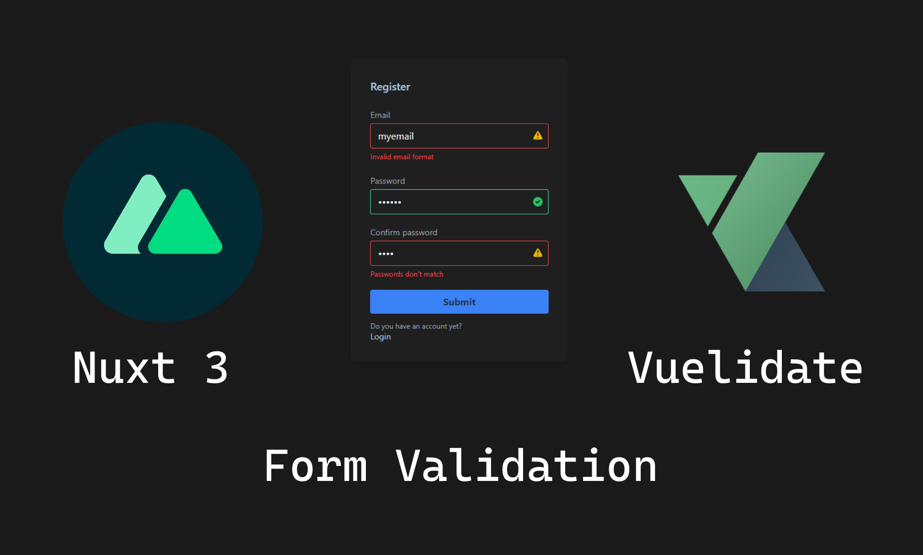
How to add form validation to your Nuxt 3 application
Although that Chrome has its own form validation, I think it is better if we handle it on our own with custom validations and error messages. In this post, we will see how to create custom form validations with Vuelidate, an open-source library created for these situations.
What is Vuelidate?
If you don’t know Vualidate yet, it’s a lightweight model-based validation library for the Vue ecosystem, is considered model-based because the validation rules are defined next to your data, and the validation tree structure matches the data model structure.
Installing dependencies
We are going to start off by installing a couple of dependencies:
npm install @vuelidate/core @vuelidate/validators
We are going to use @vuelidate/core to run the validation function and the @vuelidate/validators to add our validations and messages.
And due to I’m using Tailwind for this example we are going to install it along with the nuxt-icon library for a better UX/UI
npm install –save-dev @nuxtjs/tailwindcss nuxt-icon
Then we need to add the @nuxtjs/tailwindcss and the nuxt-icons modules to our nuxt.config.ts and should look like this:
export default defineNuxtConfig({
  modules: ['@nuxtjs/tailwindcss', 'nuxt-icon'],
});
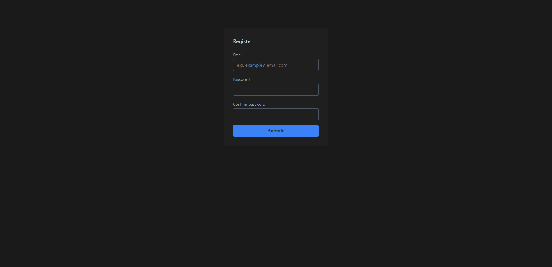
Creating our base template
Now we will create a basic form template with some Tailwind CSS utility classes to style this a little bit.
<template>
  <main class="min-h-screen bg-[#1a1a1a]">
    <section class="container mx-auto px-5 py-24 text-gray-400">
      <form
        class="bg-opacity-50 mx-auto mt-10 flex w-full flex-col rounded-lg bg-[#242424] p-8 shadow-lg md:mt-0 md:w-1/2 lg:w-2/6"
      >
        <h2 class="mb-5 text-lg font-medium text-[#aac8e4]">Register</h2>

        <!-- Email input -->
        <div class="relative mb-4">
          <label for="email" class="text-sm leading-7 text-gray-400">Email</label>
          <div class="relative">
            <input
              type="text"
              id="email"
              name="email"
              placeholder="e.g. example@email.com"
              class="bg-opacity-20 w-full rounded border border-gray-600 bg-transparent py-1 px-3 text-base leading-8 text-gray-100 outline-none transition-colors duration-200 ease-in-out placeholder:text-gray-500 focus:border-blue-500 focus:bg-transparent focus:ring-2 focus:ring-transparent"
            />
          </div>
        </div>

        <!-- Password input -->
        <div class="relative mb-4">
          <label for="password" class="text-sm leading-7 text-gray-400">Password</label>
          <div class="relative">
            <input
              type="password"
              id="password"
              name="password"
              class="bg-opacity-20 w-full rounded border border-gray-600 bg-transparent py-1 px-3 text-base leading-8 text-gray-100 outline-none transition-colors duration-200 ease-in-out focus:border-blue-500 focus:bg-transparent focus:ring-2 focus:ring-transparent"
            />
          </div>
        </div>

        <!-- Confirm Password input -->
        <div class="relative mb-4">
          <label for="confirmPassword" class="text-sm leading-7 text-gray-400"
            >Confirm password</label
          >
          <div class="relative">
            <input
              type="password"
              id="confirmPassword"
              name="confirmPassword"
              class="bg-opacity-20 w-full rounded border border-gray-600 bg-transparent py-1 px-3 text-base leading-8 text-gray-100 outline-none transition-colors duration-200 ease-in-out focus:border-blue-500 focus:bg-transparent focus:ring-2 focus:ring-transparent"
            />
          </div>
        </div>

        <button
          type="submit"
          class="rounded border-0 bg-blue-500 py-2 px-8 font-bold text-[#213547] transition-colors duration-500 hover:bg-blue-600 focus:outline-none"
        >
          Submit
        </button>
      </form>
    </section>
  </main>
</template>
And it should like this:
Defining the state
We need to define the data that we need to bind to our form and for that, we are going to create a reactive object with the email, password, and password confirmation properties
const formData = reactive({
  email: '',
  password: '',
  confirmPassword: null,
});
After that, we can bind the state data for each input with the v-model directive
<div class="relative mb-4">
  <label for="email" class="text-sm leading-7 text-gray-400">Email</label>
  <div class="relative">
    <input
      v-model="formData.email"
      type="text"
      id="email"
      name="email"
      placeholder="e.g. example@email.com"
    />
  </div>
</div>
Creating the validations
Once we have this, we can create the rules that need to match our state. We need to go ahead and import the Vuelidate function along with the validators we are going to use in this example. Now we can create a rules variable that is going to be equal to a computed property that returns an object with the same state properties and also we include the corresponding validators.
import { required, email, sameAs, minLength } from '@vuelidate/validators';

// Some code

const rules = computed(() => {
  return {
    email: { required, email },
    password: { required, minLength: minLength(6) },
    confirmPassword: { required, sameAs: sameAs(formData.password) },
  };
});
We can go further if we also import the helpers from @vuelidate/validators so we can add custom messages with the withMessage method
import { required, email, sameAs, minLength, helpers } from '@vuelidate/validators';

const rules = computed(() => {
  return {
    email: {
      required: helpers.withMessage('The email field is required', required),
      email: helpers.withMessage('Invalid email format', email),
    },
    password: {
      required: helpers.withMessage('The password field is required', required),
      minLength: minLength(6),
    },
    confirmPassword: {
      required: helpers.withMessage('The password confirmation field is required', required),
      sameAs: helpers.withMessage("Passwords don't match", sameAs(formData.password)),
    },
  };
});
Creating the v$ function
In order to run our validations we need to use the useVuelidate function imported from @vuelidate/core and we do that by creating a variable named v$ (by convention) and passing the rules and the state as the parameters.
import { useVuelidate } from '@vuelidate/core';

const v$ = useVuelidate(rules, formData);
Validating each field
We can validate all the fields at once when we submit the form but I also prefer to validate each field individually in order to notify the user about any errors before we submit the form and for that, we can use the $touch method from vuelidate along with the field name and validate it after a change event.
<input
  v-model="formData.email"
  type="text"
  id="email"
  name="email"
  placeholder="e.g. example@email.com"
  @change="v$.email.$touch"
/>
CSS classes depending on the validation result
We can also bind some classes to our input field with the :class attribute depending on the output of the validation using green if the field is correct or red if we need to correct something.
<input
  class="bg-opacity-20 w-full rounded border border-gray-600 bg-transparent py-1 px-3 text-base leading-8 text-gray-100 outline-none transition-colors duration-200 ease-in-out placeholder:text-gray-500 focus:border-blue-500 focus:bg-transparent focus:ring-2 focus:ring-transparent"
  :class="{
    'border-red-500 focus:border-red-500': v$.email.$error,
    'border-[#42d392] ': !v$.email.$invalid,
  }"
/>
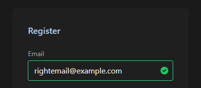
Showing the corresponding icon depending on the validation result
We can use the same method to render the corresponding icon if the validation went right or if it went wrong.
<template>
  <!-- Some code -->
  <div class="relative">
    <input
      v-model="formData.email"
      type="text"
      id="email"
      name="email"
      placeholder="e.g. example@email.com"
      class="bg-opacity-20 w-full rounded border border-gray-600 bg-transparent py-1 px-3 text-base leading-8 text-gray-100 outline-none transition-colors duration-200 ease-in-out placeholder:text-gray-500 focus:border-blue-500 focus:bg-transparent focus:ring-2 focus:ring-transparent"
      :class="{
        'border-red-500 focus:border-red-500': v$.email.$error,
        'border-[#42d392] ': !v$.email.$invalid,
      }"
      @change="v$.email.$touch"
    />

    <!-- The icon is going to render but the name of the icon it will depend on the validation output and the color as well -->
    <Icon
      v-if="!v$.email.$invalid || v$.email.$error"
      class="absolute right-2 h-full text-xl text-green-500"
      :class="{ 'text-green-500': !v$.email.$invalid, 'text-yellow-500': v$.email.$error }"
      :name="`heroicons-solid:${!v$.email.$error ? 'check-circle' : 'exclamation'}`"
    />
  </div>
  <!-- Some code -->
</template>
And depending on the output it should look like one of these examples:

Run our validations before we submit the form
Finally, run our validations when the form is submitted with the $validate() method and we can run the submission logic if there was any errors in our validations.
const submitForm = () => {
  v$.value.$validate();
  if (!v$.value.$error) {
    //    Some code
  }
};
Conclusions
Once you made this validation login form you should be able to re-use this code for all of your forms that need validation or simply use it when you need to validate any input field in your application and you can get help by checking the docs.
Source
You can find the source code from my Github HERE
Learn more about the Vuelidate library in the docs HERE
Related posts
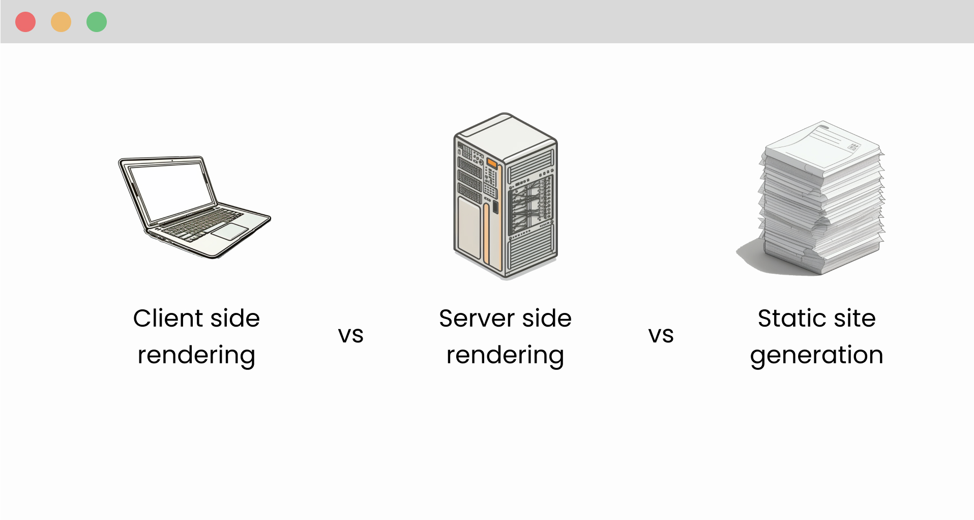
What are the differences between client side rendering, server side rendering and static site generation
Unsure which method of rendering is best for your website? Read this blog post on the differences between client-side rendering, server-side rendering, and static site generation to make an informed decision.
#frontend
How to setup user authentication with Nuxt 3, Supabase and Tailwind CSS
Add authentication to your Nuxt 3 application easyly with Supabase and restrict access to logged in users only
#frontend
How to setup Nuxt 3 with Tailwind CSS, Pinia and Supabase
Learn how to create a boilerplate project in order to start your next project faster
#frontend